Last Updated: June 16, 2025
Okay, let’s dive deep into the world of landing pages and transform your conversion rates! We’re going to explore what makes a landing page not just good, but great – the kind that turns curious clickers into committed customers.
Let’s say you’ve got a fantastic product or service; your ads are pulling people in, but are they sticking around? Are they taking that crucial next step? If not, your landing page might be the culprit. But don’t worry, by the end of this blog, you’ll learn how to create top performing landing pages and understand why they work.
The Importance of a Great Landing Page
Ever clicked on an ad that piqued your interest, only to land on a generic homepage that left you wondering where to go next? That’s precisely the whole point of having a landing page. Unlike your website’s homepage, which is like a busy department store directory, a landing page is a specialist boutique, laser-focused on a single offering and a single goal: conversion through a CTA (Call to Action).
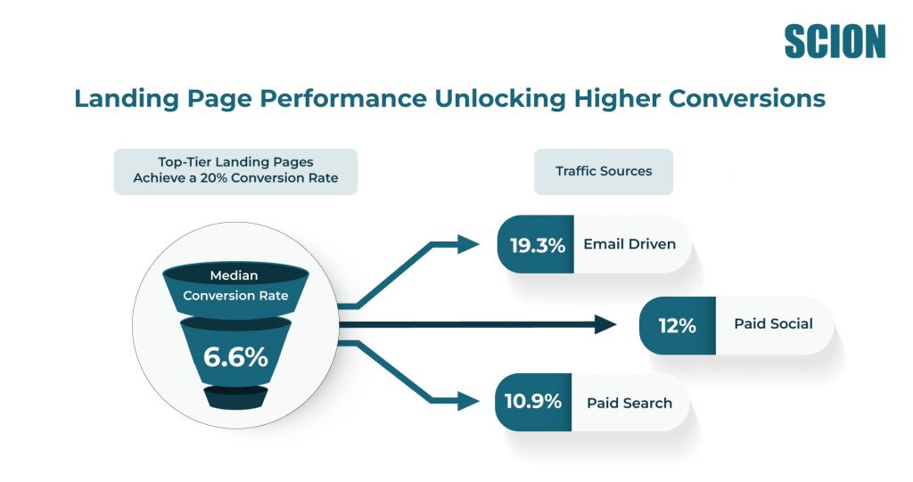
According to an article by Sci-Tech Today, the median landing page conversion rate is 6.6%, with top pages exceeding 20%. Email-driven traffic leads with a 19.3% conversion rate, outperforming paid search (10.9%) and paid social (12%).
According to an article by Sci-Tech Today, the median landing page conversion rate is 6.6%, with top pages exceeding 20%. Email-driven traffic leads with a 19.3% conversion rate, outperforming paid search (10.9%) and paid social (12%).

So, why do some of them have that Midas touch, turning visitors into leads or customers effortlessly, while others just… don’t? Let’s break down the anatomy of high converting landing pages.
The Core Blueprint: What Every High-Converting Landing Page Needs
Think of your landing page as your star salesperson, working 24/7. It needs to be persuasive, clear, and trustworthy. Here’s what the best landing page examples consistently get right:
1. A Killer Headline & Subheadline
This is your first impression – so make it count! Your headline must grab attention and clearly communicate the primary benefit (the Unique Selling Proposition – USP). The subheadline can then elaborate slightly, providing more context.
- Why it works: In a world of fleeting attention spans, you have seconds to convince someone they’re in the right place. A compelling headline that speaks directly to their needs or problems is magnetic.
- Tip: Focus on clarity over cleverness. What pain point are you solving or what desire are you fulfilling?
2. Compelling & Relevant Visuals (The Right Kind!)
A picture is worth a thousand words, but only if it’s the right picture. Use high-quality images or videos that are directly relevant to your product or service and showcase it in the best light.
- Why it works: Visuals break up text, evoke emotion, and can demonstrate value much faster than words alone. A video demonstrating your product, or an image showing a happy customer, can be incredibly persuasive.
- Tip: Avoid generic stock photos. Authentic visuals that align with your brand and message build more trust. Consider hero shots (large, impactful images showcasing your offering) or short explainer videos.
3. Persuasive, Benefit-Driven Copy
Your words need to sell the dream, not just the features. Focus on how your offering solves the visitor’s problem or makes their life better. Use clear, concise language, and bullet points for readability.
- Your words need to sell the dream, not just the features. Focus on how your offering solves the visitor’s problem or makes their life better. Use clear, concise language, and bullet points for readability.
- Tip: Speak your customer’s language. Understand their pain points and address them directly. Use action verbs and keep sentences relatively short.
4. A Crystal-Clear & Prominent Call-to-Action (CTA)
This is arguably the most crucial element. Your CTA button should stand out visually (think contrasting colors) and use actionable text (e.g., “Get Your Free Quote,” “Download the Guide,” “Start Your Trial” instead of just “Submit”).
Why it works: The CTA is the gateway to conversion. If it’s hidden, confusing, or uninspiring, visitors won’t click it, no matter how great the rest of your page is.
Tip: Place your CTA strategically – often above the fold, and then repeat it if the page is long. Ensure there’s only one primary CTA to avoid confusion.
5. Trust Signals & Social Proof
Why should they trust you? Testimonials, customer logos, case study snippets, security badges (for payment pages), or even press mentions can significantly boost credibility.
- Why it works: People trust other people. Seeing that others have had a positive experience with your offering reduces perceived risk and builds confidence.
- Tip: Use genuine testimonials with names and photos if possible. Quantifiable results in your social proof (e.g., “Trusted by 10,000+ businesses”) are also powerful.
6. Minimal Distractions – Well-laid out UX/UI design
Remember, a landing page has one job. Remove unnecessary navigation links, sidebars, and anything else that could divert the visitor’s attention from your CTA. Simplicity is key for top landing page designs.
- Why it works: Fewer choices mean less confusion and a clearer path to your desired action. It keeps the visitor focused on the value proposition and the conversion goal.
- Tip: Think of it as a funnel. Guide the user directly from their entry point to the conversion, removing any potential “leaks.”
7. Mobile Responsiveness is Non-Negotiable
A significant chunk of web traffic comes from mobile devices. Your landing page must look and function flawlessly on all screen sizes.
- Why it works: A poor mobile experience leads to high bounce rates and lost conversions. If users have to pinch and zoom, they’ll likely leave.
- Tip: Test your landing page on various devices and browsers. Ensure buttons are easily tappable and forms are simple to fill out on a smaller screen.
8. Lightning-Fast Loading Speed
Every second counts. Slow-loading pages frustrate users and can tank your conversion rates before they even see your offer.
- Why it works: Patience is thin online. If your page takes too long to load, visitors will hit the back button without a second thought.
- Tip: Optimize images, leverage browser caching, and minimize code to ensure your page loads quickly.
9. Optimized Lead Capture Forms (If Applicable)
If you’re collecting leads, keep your forms as short and simple as possible. Only ask for the information you absolutely need.
- Why it works: Longer forms create more friction. The less work a visitor has to do, the more likely they are to complete the form.
- Tip: Clearly state why you need the information and what they’ll get in return. Consider multi-step forms for more complex information gathering.

Landing Page Optimization: The Ongoing Journey to Perfection
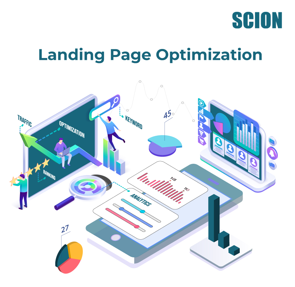
Creating a landing page isn’t a “set it and forget it” task. The secret to consistently high converting landing pages lies in ongoing landing page optimization. This means testing, analyzing, and refining.

1. A/B Testing is Your Best Friend:
Don’t guess what works – test it! Create variations of your landing page (e.g., different headlines, CTAs, images, layouts) and see which one performs better. Tools like Unbounce, Google Optimize, or built-in features in your landing page platform make this easier than ever.
2. Analyze Key Metrics: Keep a close eye on:
- Conversion Rate: The percentage of visitors who complete your desired goal. This is your ultimate success metric.
- Bounce Rate: The percentage of visitors who leave after viewing only one page. A high bounce rate might indicate a mismatch between your ad and landing page, poor design, or slow load times.
- Time on Page: How long visitors are staying. More time can indicate engagement, but it needs to be paired with conversion data.
- Form Abandonment Rate (if applicable): How many people start filling out your form but don’t complete it.
3. Use Heatmaps and User Recordings
Tools like Hotjar or Crazy Egg can show you where users are clicking, how far they scroll, and even record anonymized sessions. This provides invaluable insights into user behavior and friction points.
What Top Landing Pages Do Differently
While the exact look of top landing page examples can vary wildly depending on the industry and offer, they all nail the core principles mentioned above.
Think about some of the best landing page examples you’ve encountered:
- SaaS Companies (e.g., Slack, Shopify): Often feature clean designs, benefit-oriented headlines, a clear CTA for a free trial or demo, and social proof from well-known clients. Their top landing page designs are all about clarity and building immediate value.
- E-commerce Product Pages (e.g., a specific product on Amazon or a direct-to-consumer brand): These excel with high-quality product imagery/videos, compelling descriptions, customer reviews, and a prominent “Add to Cart” or “Buy Now” button.
- Lead Generation Pages for Services/Webinars (e.g., Neil Patel, HubSpot): These pages typically offer a valuable piece of content (ebook, webinar, checklist) in exchange for contact information. They have a strong headline emphasizing the value of the offer, a concise form, and clear bullet points outlining what the user will gain.
- The common thread? They understand their audience, present a clear value proposition, make the desired action obvious and easy, and build trust.
More on: types of landing pages
Ready to Boost Your Conversions?
Creating high converting landing pages isn’t about magic; it’s about understanding your audience, applying proven principles, and committing to continuous improvement through landing page optimization. Start by focusing on clarity, value, trust, and a single, compelling call to action. Look at some of the best landing page examples in your industry and beyond, not to copy, but to understand the principles behind their top landing page designs.
FAQ’s
Got questions? You’re not alone! Here are some common queries about landing pages:
A high-converting landing page is meticulously designed with a single, focused objective. It features a compelling headline and benefit-driven copy, relevant and engaging visuals, a clear and prominent call-to-action, trust signals (like testimonials), minimal distractions, fast loading speed, and is mobile-responsive. Crucially, it meets the expectations set by the ad or link that brought the visitor there and makes it incredibly easy for them to take the desired next step. Ongoing landing page optimization through A/B testing is also key.
You’ll know your landing page is performing well by tracking key metrics. The most important is the conversion rate – the percentage of visitors who complete the desired action (e.g., sign up, download, purchase). Other important indicators include a low bounce rate (visitors leaving without interacting), a reasonable time on page (indicating engagement), and for lead gen forms, a low form abandonment rate. Comparing these metrics against industry benchmarks and your own historical data (especially during A/B tests) will tell you if it’s performing well and where there’s room for improvement.
It depends on the landing page’s purpose.
- Often, NO for campaign-specific pages: Many marketing campaign landing pages (e.g., for a limited-time offer or a PPC ad) are often set to ‘noindex’. This is because they are highly targeted, might be temporary, or you might have many variations for testing, and you don’t want them diluting your main website’s SEO or appearing out of context in organic search results. Visitors should arrive via a specific marketing channel.
- Sometimes, YES for evergreen content/offers: If your landing page offers substantial, unique, and evergreen content (like an ultimate guide that also serves as a lead magnet), you might want it indexed so it can attract organic traffic over time. The general rule of thumb is: if the page is designed for a very specific, often short-term, paid campaign, ‘noindex’ is common. If it’s a more permanent resource, indexing could be beneficial.

[…] Pro tip: Best for marketing on a budget and to leverage a good landing page. […]