You must have heard the phrase ‘First impression is the last impression’-this may not hold true for everyone or everything, but it sure does make a difference when we’re talking about websites.
According to a recent study, “Ninety-two percent of consumers will visit a brand’s website for the first time for reasons other than making a purchase.”
The study that focused on eCommerce websites further pointed out that 98% of the shoppers were discouraged from completing a purchase due to poor engagement on websites.
These statistics will definitely get you thinking about the nature of the content on your website and the way it is presented to the visitor. Web design is fast becoming one of the most integral areas of work in the world of digital marketing and design geeks are always on the lookout for new, unique tools that can help a website stand out!
Here’s a list of the latest web design trends that will help enhance customer engagement online:
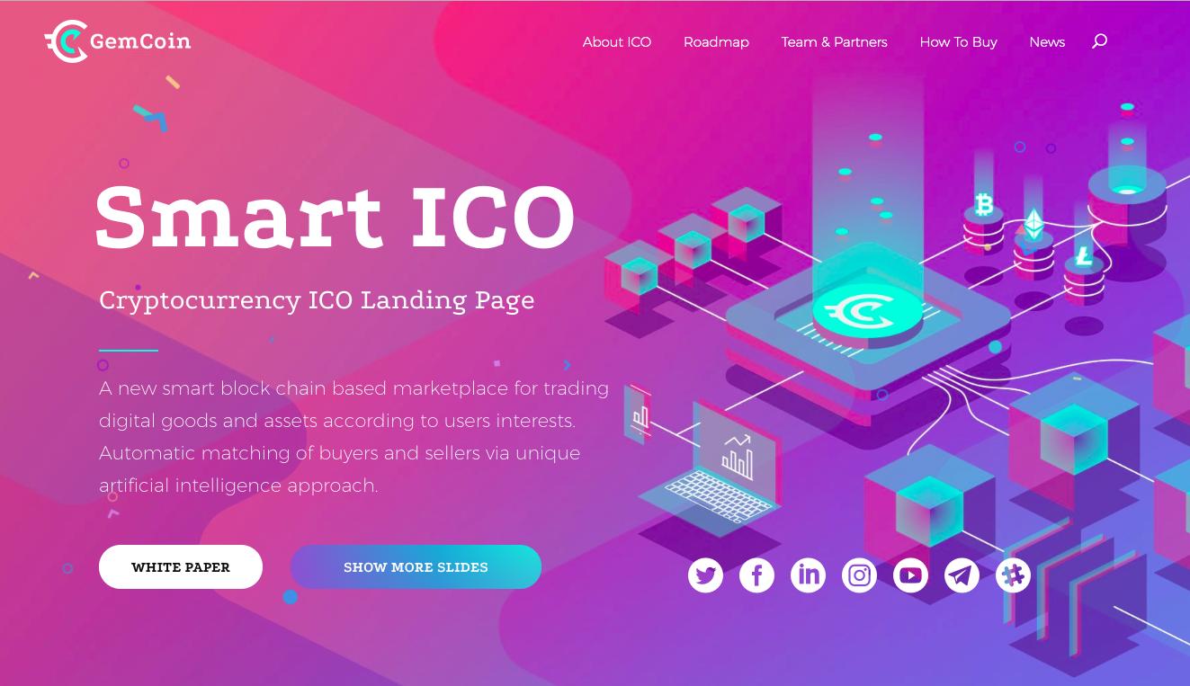
Larger Than Life Colour Tones:
2017-18 saw a lot of Black & white, soft tones, but this year designers are going all out with some sassy, bright colour tones that are all set to evoke emotion. Especially fashion portals, interior design, digital marketing all are opting for young, joyful colours. Cooler tones like Purple, Blue, Green are doing the rounds.
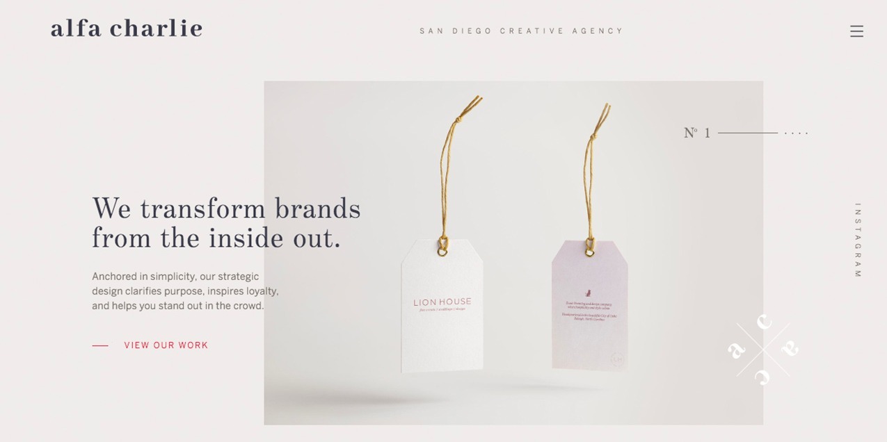
Minimalistic, Asymmetrical Layouts:
Less Is More-has been the mantra for almost everything in recent times, and in website design, it’s no different. Though more challenging to execute, asymmetrical layouts are powerful and eye-catching. One has to have a good insight about whitespace, layering & proportion; in fact, asymmetrical layouts also help eliminate non-essential design elements and produce a more focussed design.
Copy-Friendly Designs:
Designers know that text-heavy websites will do nothing more than drive visitors away, and so for years white spacing, line spacing & contrasting have been making websites look neat and reader-friendly. But today, they’re taking the copy-design relationship to another level by ideating with copywriters and marketers, adding more visuals to support fewer words, and using fonts, layouts and colours that will increase legibility.
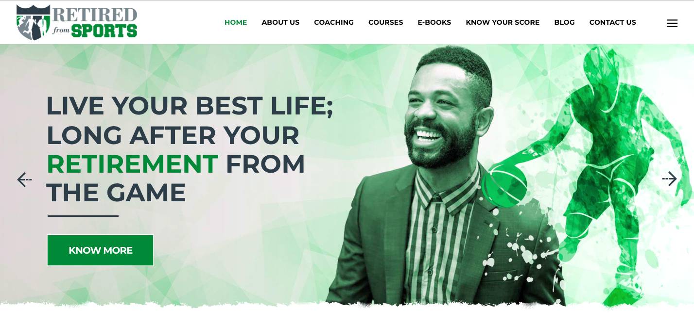
Personalised, Curated Visuals:
As we said in the beginning, a website is not just a platform for you to introduce your product/service to customers but it’s an impression your making. Brands want to make sure their websites represent the values they stand for. Designers are hence choosing to create visuals from scratch; visuals that will help assert unique brand identity. Curated visuals bring uniqueness, authenticity, help easily communicate abstract/complex concepts (software..b2b..) in an easier way and help bring about inclusivity & diversity.
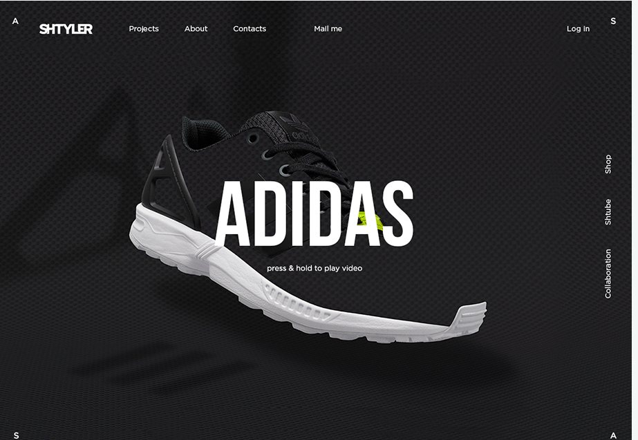
Videos:
Slowly becoming a must-have for website videos allow for instant communication, with a potential customer. Websites are now sporting a video right at the top, especially product brands. Simple time-lapse or sequencing techniques can be used to hook the reader in the first few seconds. Even sound isn’t required.


