
Yay! Someone just clicked on your ad on Facebook! Well to keep that excitement going the next task at hand is to ensure that the prospective customer completes the form on your landing page.
Web forms are the gateway after passing through which the user becomes a member. It’s where all the action takes place.
Sometimes that may not be the case. users may just click out even without filling the form. Now you must be wondering as to why this is happening. Cluttered, long and extraneous questions that make a simple interaction are the answer to your question.
So, how can you build a better web form? Here are some tips listed by Social Media Today.
1. Keep the page uncluttered
Your web form’s purpose is to allow users to complete the desired task – so you need to make it as easy as possible for them to do so.
Include only the most important information and keep it as brief as possible. Include some white space in the form’s design; it makes it form “feel” uncluttered.
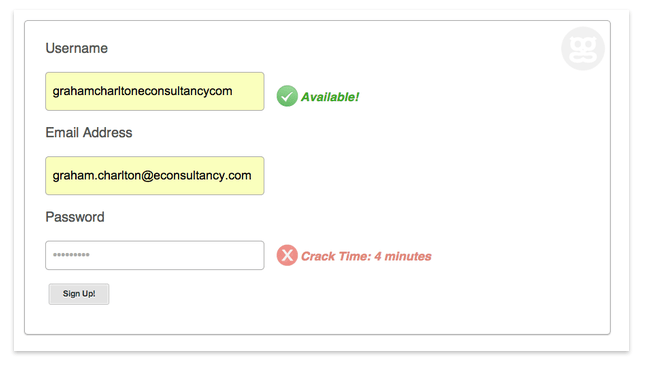
Graham Charlton of EConsultancy lists this form from Geeklist as an example of a great web form. It’s clean, simple, and gets the job done.
2. Don’t ask for too much information
Drop-off rates increase as you include more extraneous questions and fields. Of course, you want to get know as much as you can about your users via your form, but only include necessary questions.
“This is probably one of the most common problems out there: you want 12 pieces of information from your visitor, and they’re only willing to give you two. This comes down to having a thorough internal discussion about which fields you absolutely require and which could be removed,” says Ian Everdell of Mediative.
What’s the optimum number of fields? If you can have only three or four, your completion numbers will be higher.
Really, really want more information about your users? Everdell says, “If you have a CRM system that ties into your web forms, it likely has some sort of progressive profiling feature built in. When a visitor comes to your site and converts multiple times (e.g., downloading several white papers), they’re presented with different fields on each form. This lets you collect, say, ten pieces of information while only asking your visitor for four at any given time.”
3. Make it easy
There are a lot of ways to make forms easier for users.
Make sure that the length of a field is appropriate for the type of data it will contain – a postal code, for example, should be 5 characters long.
Make it clear which fields are required and which are optional.
Research shows that the best place to put labels depends on how familiar the form is. In a familiar form, such as one to sign-up for an event or to buy a t-shirt, put the labels above the fields. In an unfamiliar or very complex form, put the labels to the left of the fields.
Keep related questions together. Everdell says, “Grouping related fields together gives the visitor the opportunity to scan the groups and get a high level sense of what is required; however, only use the minimum number of visual elements necessary to communicate useful relationships.”
Fields should auto-fill when possible. It’s easier for a user if the postal code auto-fills after they put in their street address and city. A credit card number can automatically fill the credit card type field with “Visa” or “Mastercard.”
Provide help to your user if you think they’ll need it. This is especially useful “when asking for unfamiliar data, when the user may question why the data is being collected, or there are recommended ways of providing the data,” says Everdell. But don’t give too much help. Indeed, Everdell says that if you want to offer a lot of help or tips on a form, “consider exposing them only when the visitor reaches that field (e.g., tooltips) or clicks on a help icon.”
Allow for tabbing between fields. Users expect to be able to do this now.
Everdell says, “Provide direct feedback as data is entered – use inline validation to verify input and suggest valid input if errors are found… Show errors at the top of the page and at the place where the error occurred. Make sure that they are visually distinct. Provide error messages that help the visitor understand what went wrong and how to fix it.”
4. Create a stellar “thank you” page
Your ‘Thank You” page and follow up email are just as important as the form itself. Unfortunately, they’re often an afterthought.
Be creative and make people feel good about the action they just took. Use video, images, and make it personalized. A ‘Thank You’ page is not only polite, but also continues the interaction between you and your user.
“It’s an important page because it is one of the few times you have the hyper-focused attention of your donors as they wait for their credit card payment to be processed and confirmed.