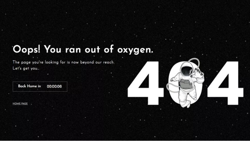
Ever seen a 404 page? Of course, you have.
A better question would be – do you remember any of the 404 pages you have seen?
404 pages are a part of the Internet, and no matter how robust your website may be, they are inevitable.
So what’s so bad about a user landing onto a page that says “404 not found“?
Does it indicate that the brand or the business is sloppy? Not at all! A 404 error simply says that the page in question is not available.
Any website can have a broken page.
There are quite a few reasons for a “Page Not Found” error to get triggered, chief of them being:
- The webpage in question has moved
- The webpage no longer exists or has been deleted
- The user has typed in the wrong URL (web address)
The 404 Problem: Pogo Sticking and More!
A 404 error page in itself is not a problem. It’s about what happens when users land on the page.
As already discussed above, 404s happen. The bigger a site, the more links it has, which could be the main reason for more broken links. Any time users land on a 404 page, they are likely to hit the back button to go back to the page that led them there.
This back-tracking once in a while is not an issue, but if many users do this, they create a phenomenon known as pogo sticking. Pogo sticking tells Google that your site’s content does not have anything related to that particular keyword.
Once that happens, your ranking for the keyword goes down. No one wants that!
So what can you do? What any enterprising and innovative business always looks to do.
You turn this issue into an opportunity by creating & serving a custom 404 page instead!
The 404 Opportunity: Get Creative!
Why not use 404 pages for actions that will help your business. Here are a few cool ideas and examples:
Put your branding on the Custom 404 page
First and the most effective action to take is to put your brand elements on the broken page. You can choose to just put the logo or add other elements like color, font, page design template, etc.
From here, you have many choices that you can make to make the page more interesting for your visitors.
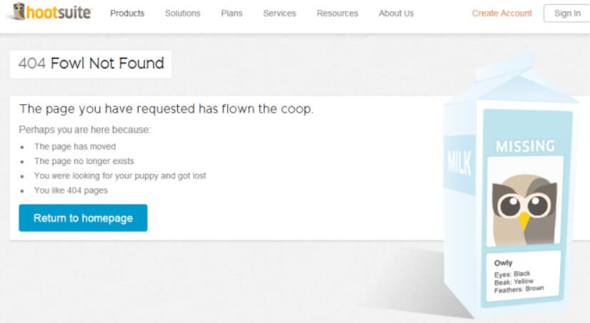
For example, take a look at HootSuite’s custom 404 page:
This page not only uses the logo, but also transforms the brand’s mascot, the owl, into a picture placeholder. It uses the ‘Missing’ person information that is usually put on a milk carton to connect with the users’ everyday life.
Users are bound to remember this page or at least be entertained by it. It helps create a positive association with the brand as well.
Pro tip: Get innovative with the design of the web page, and make it memorable.
Add a search bar
Another way of using the 404 page for keeping your ranking intact is to use a search bar on the page. A search bar invites users to type and hit search. It eliminates the need to hit the back button and go to the previous page.
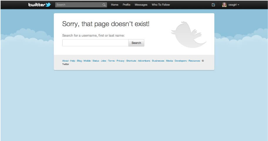
As an example, take a look at Twitter’s 404 page:
The page is simple with a prominent search bar, making it easy for users to type into the search field.
Pro tip: Keep it simple and focused; do not distract users with too much text.
Add links to other popular pages
One of the most interesting ways to keep users engaged with your website after they land on a “Page Not Found” page is to give them clear options.
Some users may find it easier to simply click on links and not go to the trouble of typing into a search field.
You can help this instinct by providing links to your most popular and prominent web pages.
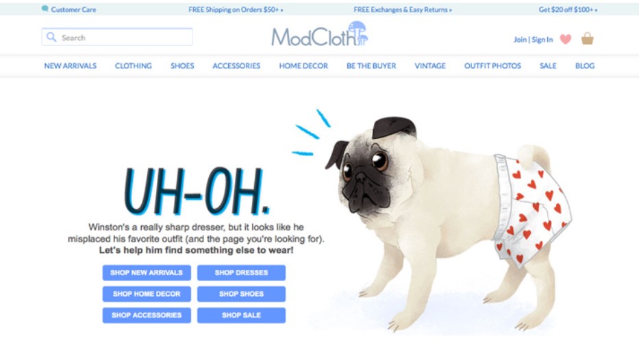
Mad Cloth does this very well:
This custom 404 page engages the user by using:
- light-hearted banter
- cute and fun cartoon dog
- prominent buttons to the most important pages
Pro tip: Do not overload the users with many choices. Lead them gently to your best pages.
Use a button to send users back to the home page
One more effective way to leverage the 404 error page favorably is to place a ‘back to homepage’ button.
The biggest advantage of a clear home button is that it stops users from hitting the back button. Users see the button and instinctively press it rather than trying to go back to the previous page.
This button, therefore, reduces the potential pogo sticking effect.
Of course, there is no need to make this invitation to the homepage boring!
Let’s take a look at a few popular 404 pages that encourage users to back to the website’s homepage.
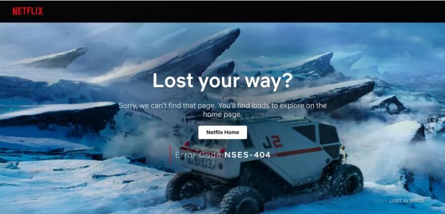
Here’s one by Netflix. It clearly places the home button and engages the user with an impressive and contextual image. It also encourages them to go to the home page.
Here’s another one by Mantra Labs that also encourages users to go to the homepage in a creative way.
Pro tip: Use contextual images or visuals in the background or in the sidebar to convey to the users their ‘lost’ status.
Highlight the brand’s personality with the 404 page’s copy and image
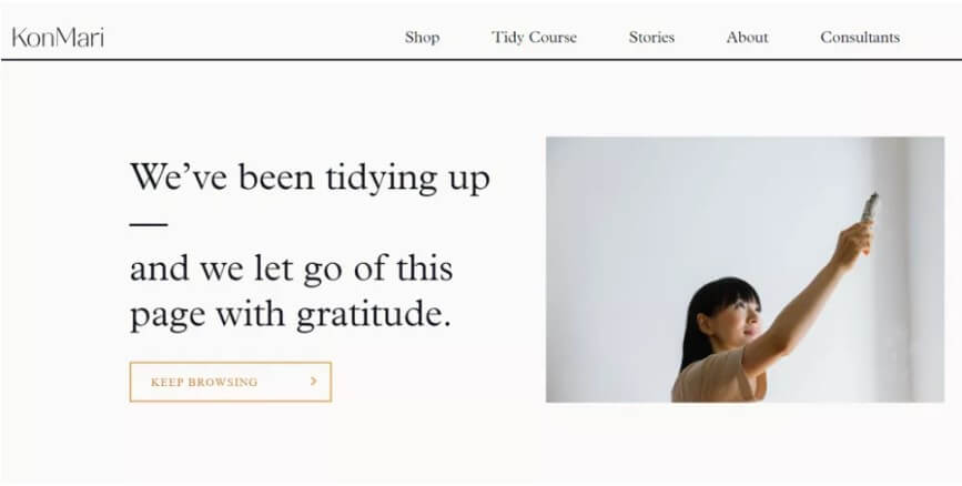
Look at the following page from KonMari.com.
This page aligns with the brand’s personality with its copy as well as the image.
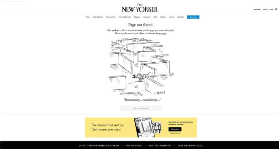
As does this one by The New Yorker:
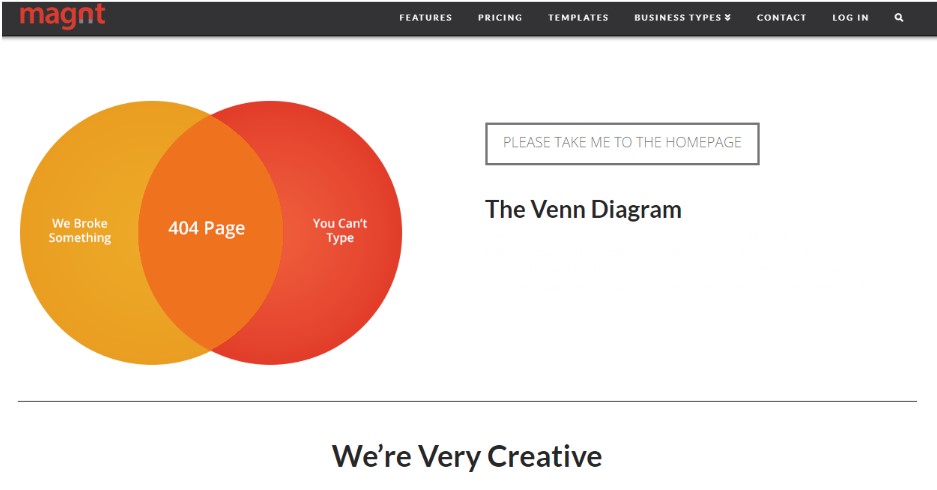
You can also list the reasons why a user may have landed on the page as a part of your copy. This type of text puts them at ease and tells them it’s ok to move ahead.
Here’s a fun way Magnt does exactly that and even declares how creative they are!
Pro tip: Use creative copy and an engaging image to convey the brand’s personality.
Effective 404 pages are easy to design especially if you get digital marketing professionals to do it for you.
We are a full-stack digital media solution agency and we can help in all aspects of branding, SEO, and digital marketing. Get in touch with us to cover all your bases in digital marketing!

